GogoBridge
Client handed us a logo. No brand guidelines, no wireframes. I extracted a full design system from it and shipped two surfaces — a bilingual landing page and a supplier dashboard.
The Problem
GoGoBridge needed a B2B e-commerce platform to connect Chinese suppliers with global buyers — in both English and Chinese. The client had no existing brand system, no design documentation, and needed both a public-facing marketing site and a private supplier management dashboard built from scratch.
Design Process
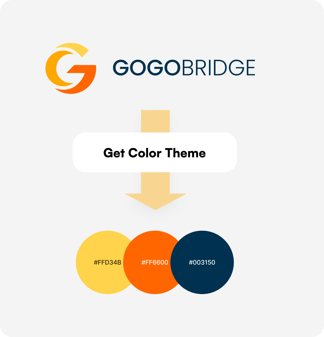
Logo was the only brief
With no brand guidelines provided, I extracted the color system directly from the logo: yellow (#FFD34B), orange (#FF6600), and navy (#003150). Everything — typography hierarchy, button styles, UI states — was derived from these three values.
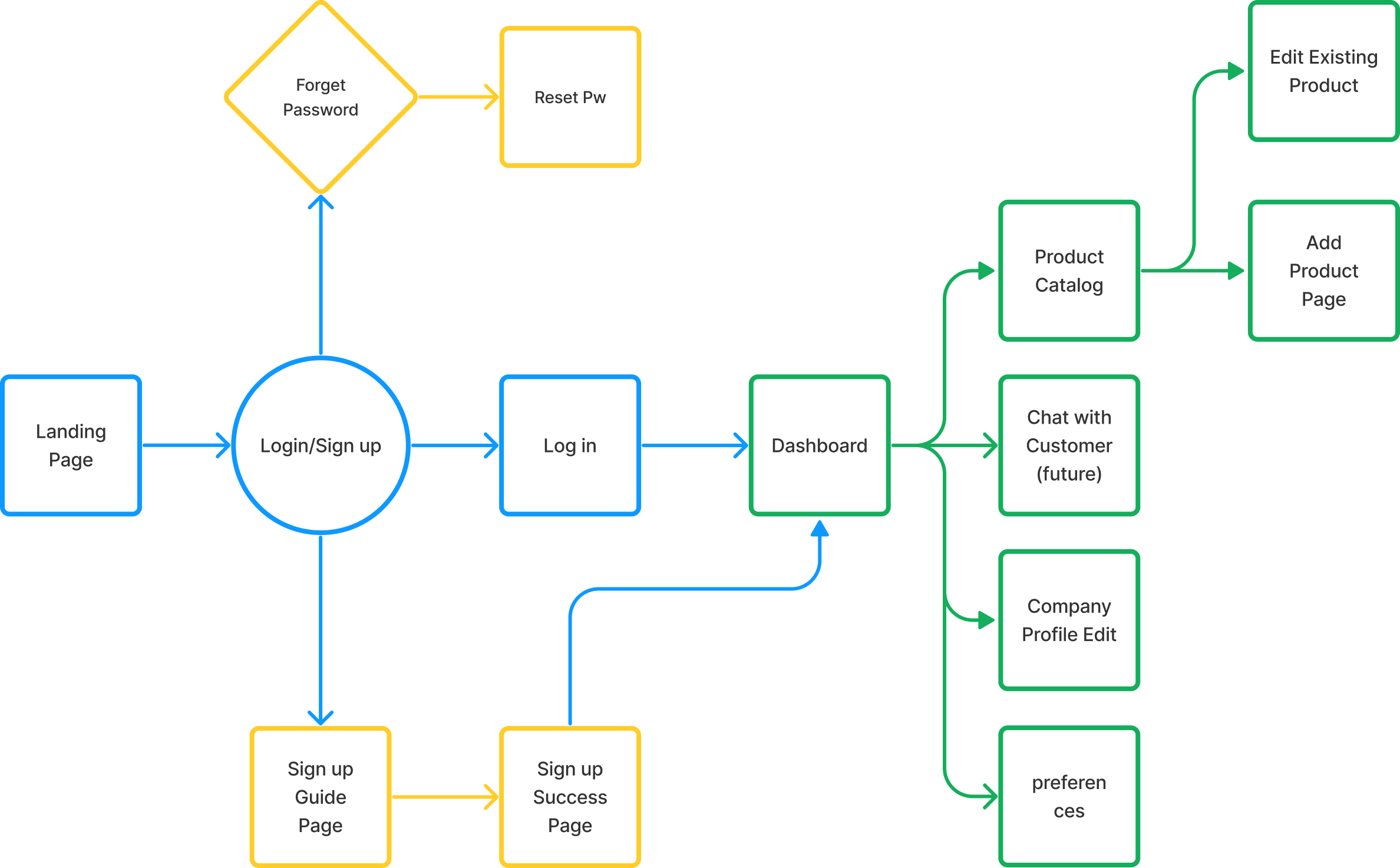
IA mapped from scratch
No wireframes existed. I mapped the full information architecture for both surfaces — landing page, login/signup flows, supplier dashboard, product catalog, profile, and preferences — before touching Figma.
4 hero iterations to find the balance
The landing page hero went through four rounds. Options 1–3 failed for different reasons — too industrial, no product imagery, or too complex for frontend. Option 4 struck the right balance between what buyers wanted to see and what was feasible to build.
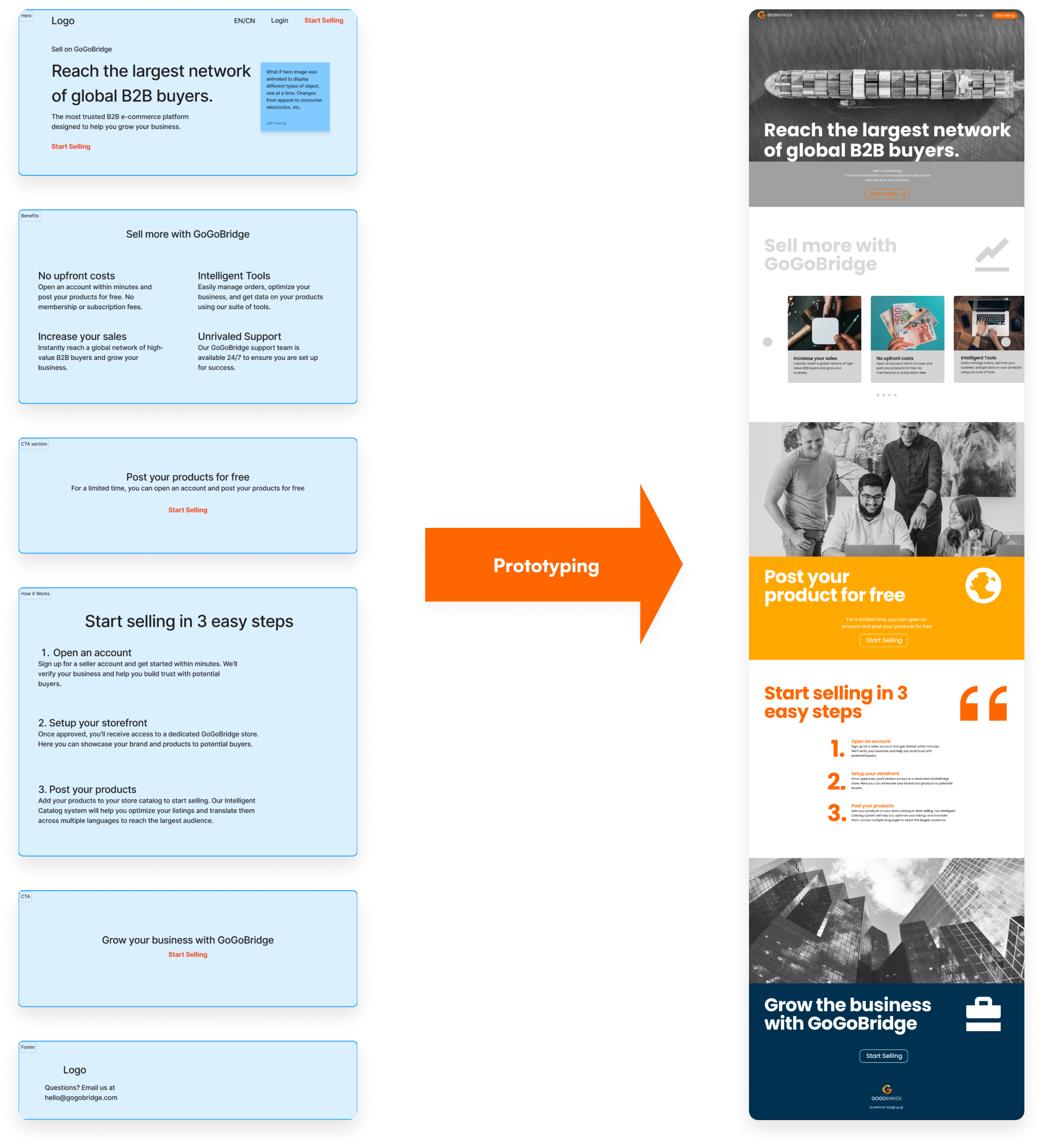

Too much like a logistics company
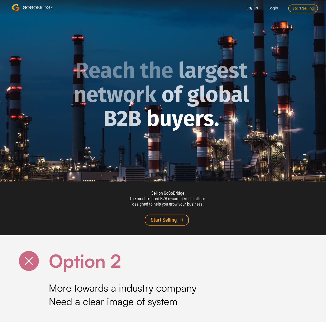
Industrial feel, no product clarity
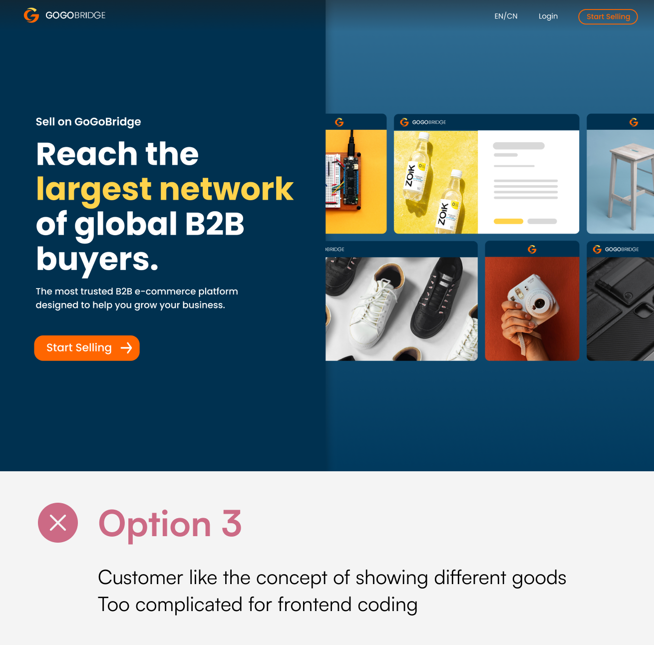
Product grid liked, but too complex to build
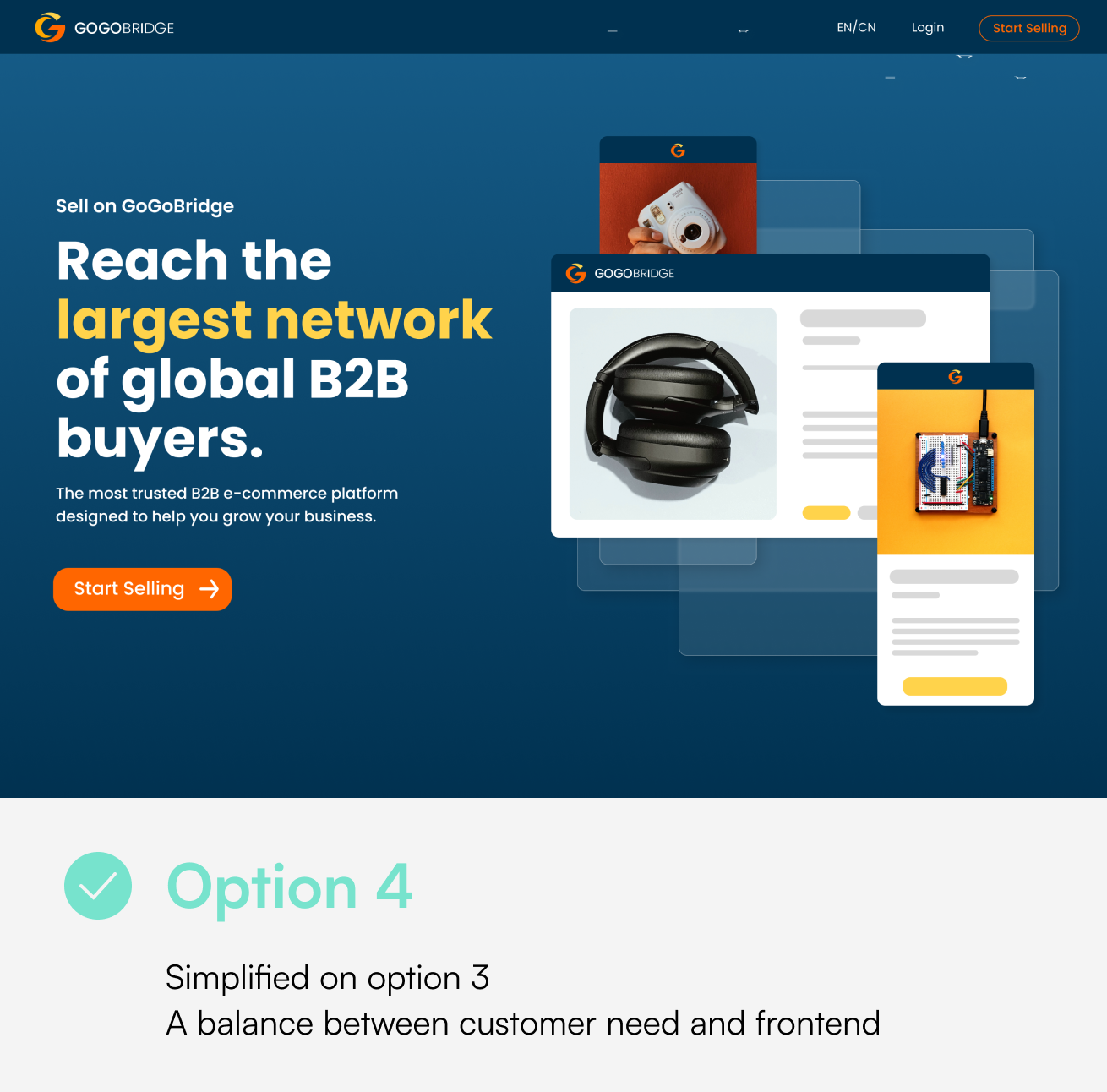
Simplified — balanced design and feasibility
What I Built
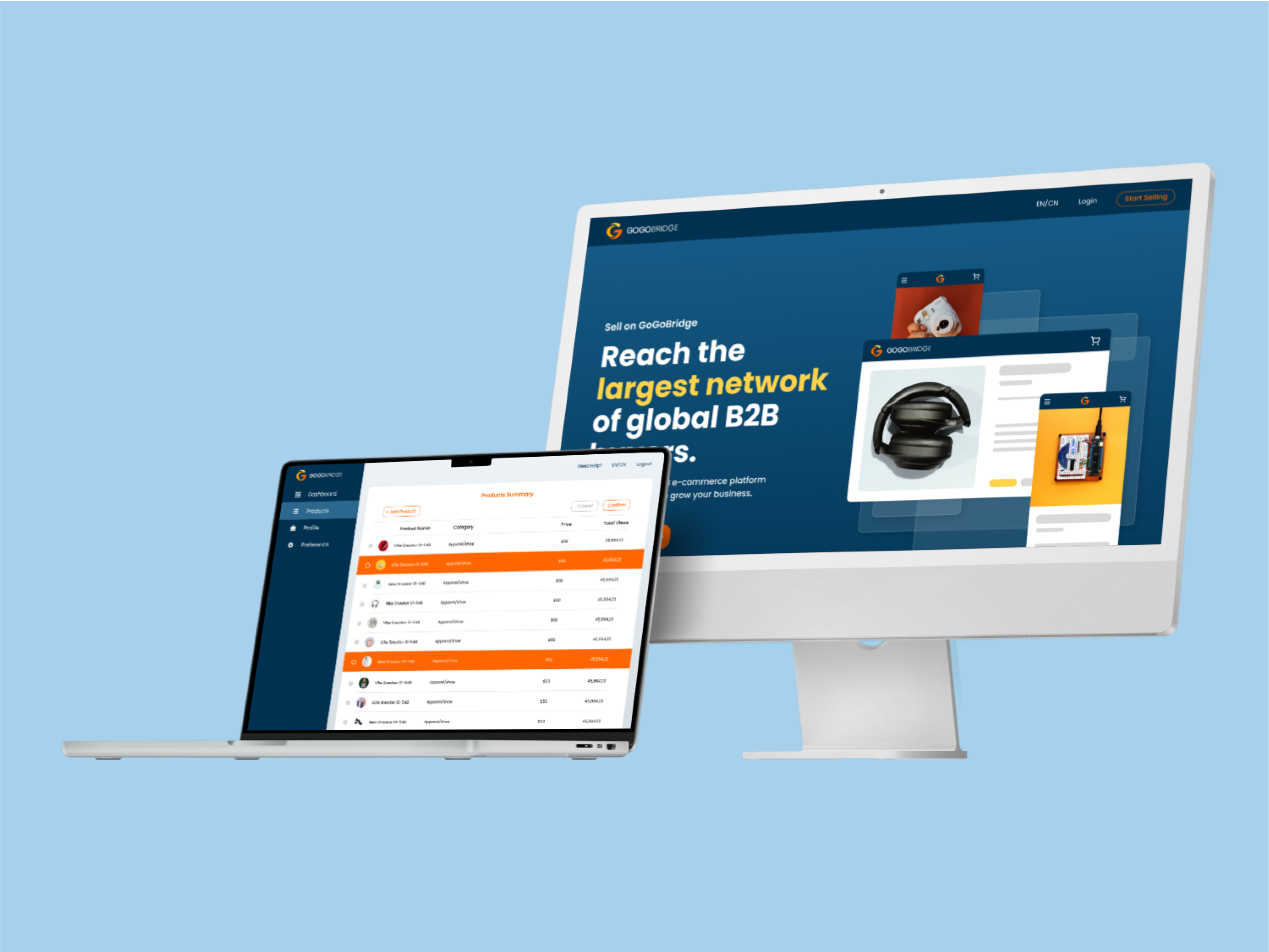
Two complete surfaces — a bilingual public landing page to convert suppliers, and a private dashboard where they manage their product catalog, company profile, and preferences.
Landing Page (EN / CN)
Supplier Dashboard
Bilingual Landing Page
EN/CN toggle in the nav. Marketing copy, feature highlights, and CTA — fully localized for both English-speaking buyers and Chinese supplier prospects.
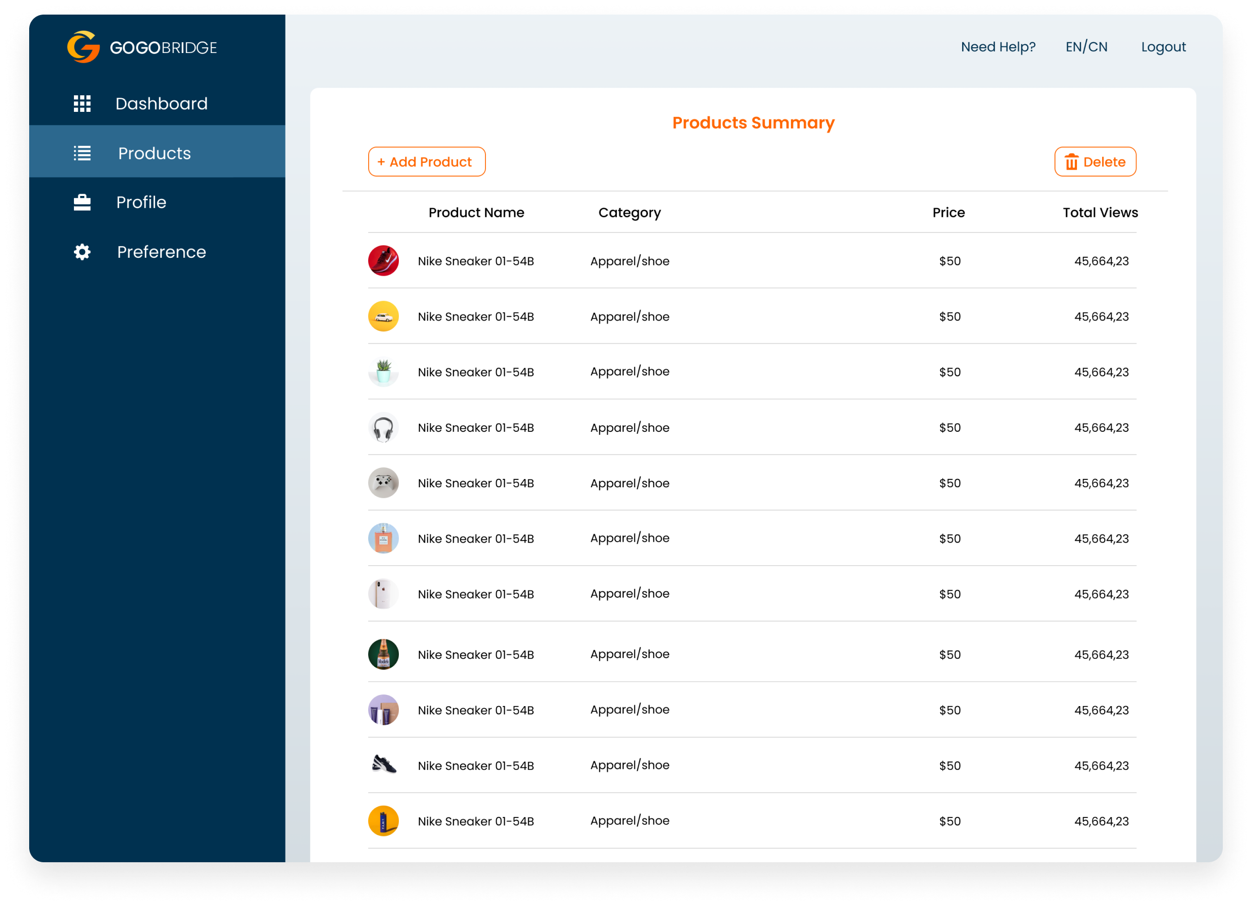
Supplier Dashboard
Product catalog with add/edit flows, company profile management, preferences, and a dashboard overview. Designed to map directly to the backend data models.
How I Built It
React + Tailwind + Material UI, solo
I built the full frontend in React with Tailwind for layout and spacing, and Material UI for form components and data tables in the dashboard. No handoff — Figma went directly to code I wrote. Being both designer and developer let me make tradeoffs in real time rather than through a back-and-forth.
UI designed to match the data model
Before designing the dashboard forms, I mapped the full data flow — what the frontend needed to send, what the backend stored, what the UI needed to display. Form fields, labels, and states were designed to reflect the data architecture, not the other way around.
Data flow mapping — UI fields designed to align with database structure
Outcome
Two surfaces shipped — Landing page and supplier dashboard both delivered to production — from logo-only brief to live product.
Zero handoff friction — Owning design and frontend removed the translation layer entirely. Design decisions could be validated in the browser in real time.
Bilingual from day one — EN/CN wasn't bolted on at the end — the language toggle was designed into the nav and layout system from the first wireframe.